
 The first Poster that my 3D Illustrated Logo was finished for.
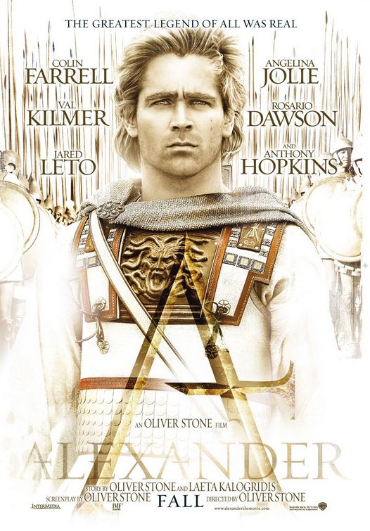
 The Second Poster that used the Logo.
 This Icon was used for a few ideas including a teaser poster with no type just an icon with a ghosted image of Colin Farrell.
 I did a few versions of the snake wrapping the letter A and this one was my favorite.
 A built out a 3D Icon that was based on architectural details found during the time of Alexander and made it into an icon for the posters. This version was a verdigris copper and brass eagle that was aged and distressed.
Project Review
3D Illustration and 3D Logos for
ALEXANDER[2004]
PART I
3D Illustration and 3D Logos for
ALEXANDER[2004]
PART I
Client:Warner Brothers Pictures via The Cimarron Group.
Art Director: Calvin Sumler.
Project Date: Winter 2004-Spring 2004
Early on when I had just started the new 3D Department over at The Cimarron Group in late 2003, I was put on the Alexander project in the Poster Department for the Theatrical release.
I started in the usual way with just some extruded logos, but I proposed to spend a bit more time to get the hand modeled Single point bevel type. I had finished the TROY logo over at BLT just before I came over to Cimarron, so I used that logo as an example and they said to go ahead.
Single point bevels are a hand modeled typeface done so they chisel to a sharp edge in the center of the type with no noticeable flat spot, apart from ones needed in the font design. My first try at this technique was time consuming at 15 to 30 minutes per letter back at BLT, but while on Alexander I tried some of the quad modeling techniques I had developed while building the Lotus Elise and the start of Herbie, the 1963 VW bug for the new Lohan film. I was able to cut the time down to less than 5 minutes per letter which made the budget a lot more feasible for the Advertising fast turnaround needed. So from this project on, I was asked when needed to recreate this look again.
I also build a variety of props and Icons including the two snakes eating each other into a circle, as well as the eagle banner icon that they used behind a few logos a in the presentation. All in all this was a very enjoyable project to work on, and I got the finish for the logo on the poster as well with the talented Art Director Calvin Sumler.
Look for a PART II in the future.
Cheers, THOM


nice
ReplyDelete